Comfort Sleep ⋅ Brand Refresh

Refreshing 45 Years of Comfort
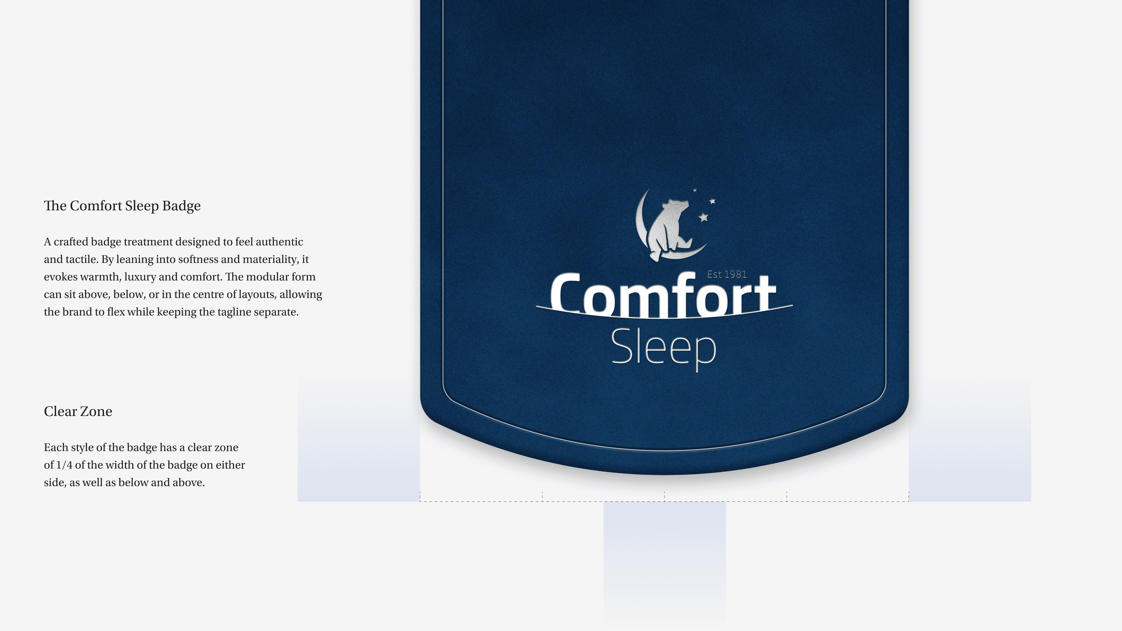
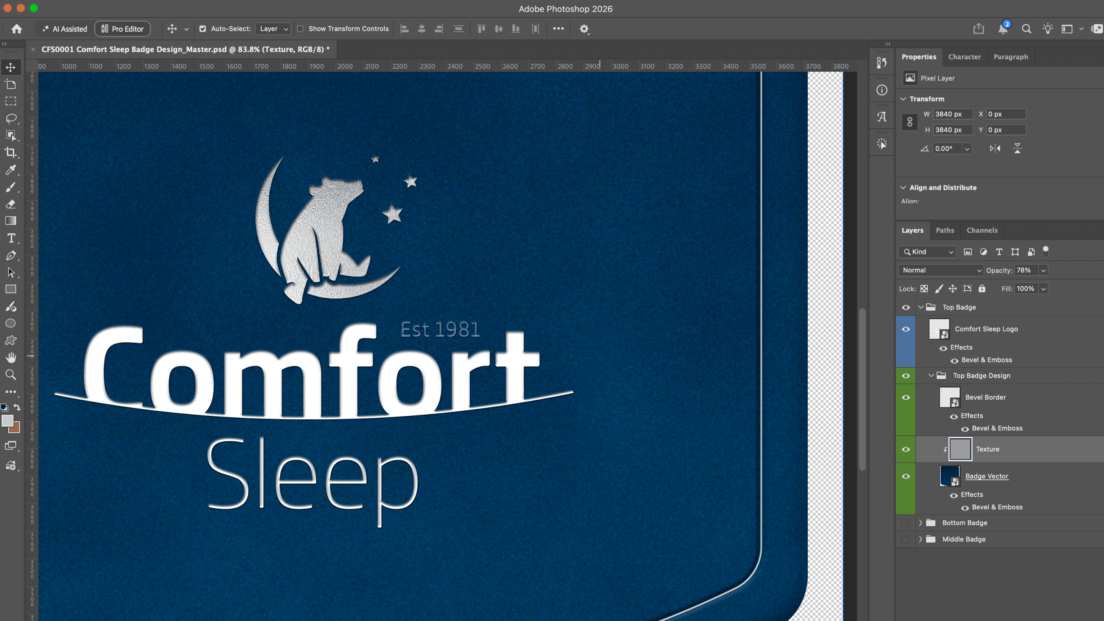
Comfort Sleep had 45 years of Australian craftsmanship behind it, but a visual identity that didn't reflect it. Taking the strategy's positioning of Only the best, the identity was rebuilt from the ground up: a new colour palette and type suite anchored by Gambarino, a typeface rooted in traditional European signage that nods to the brand's Italian-Australian ownership, alongside a badge housing for the existing mark across three flexible layouts.
The system extended into a new brand photoshoot, in-store and social assets, and a Collingwood Football Club partnership as Official Elite Sleep Partner — all underpinned by a comprehensive design system and template suite, built to let internal teams apply the new identity consistently without design support at every turn.
It's a study in building premium cues – material, craft, heritage – into a system flexible enough to carry a legacy manufacturer across retail, hospitality and sport.




Brand Strategist: Symon Van Haalen